

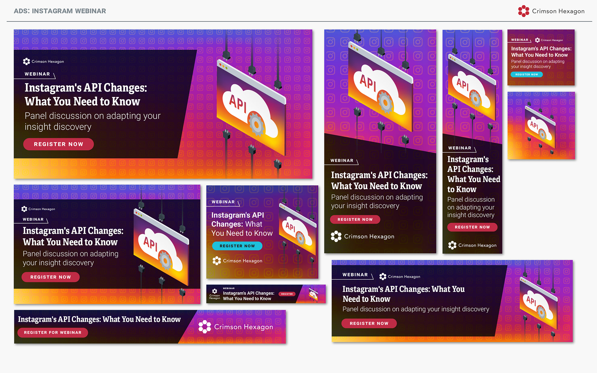
I'll admit: I don't entirely understand APIs. I got some feedback on the engineers on how to make a somewhat representative visual of an API. I'm a sucker for gradients and sunset colors, so I was amped about getting to use copious quantities of both in these ads.
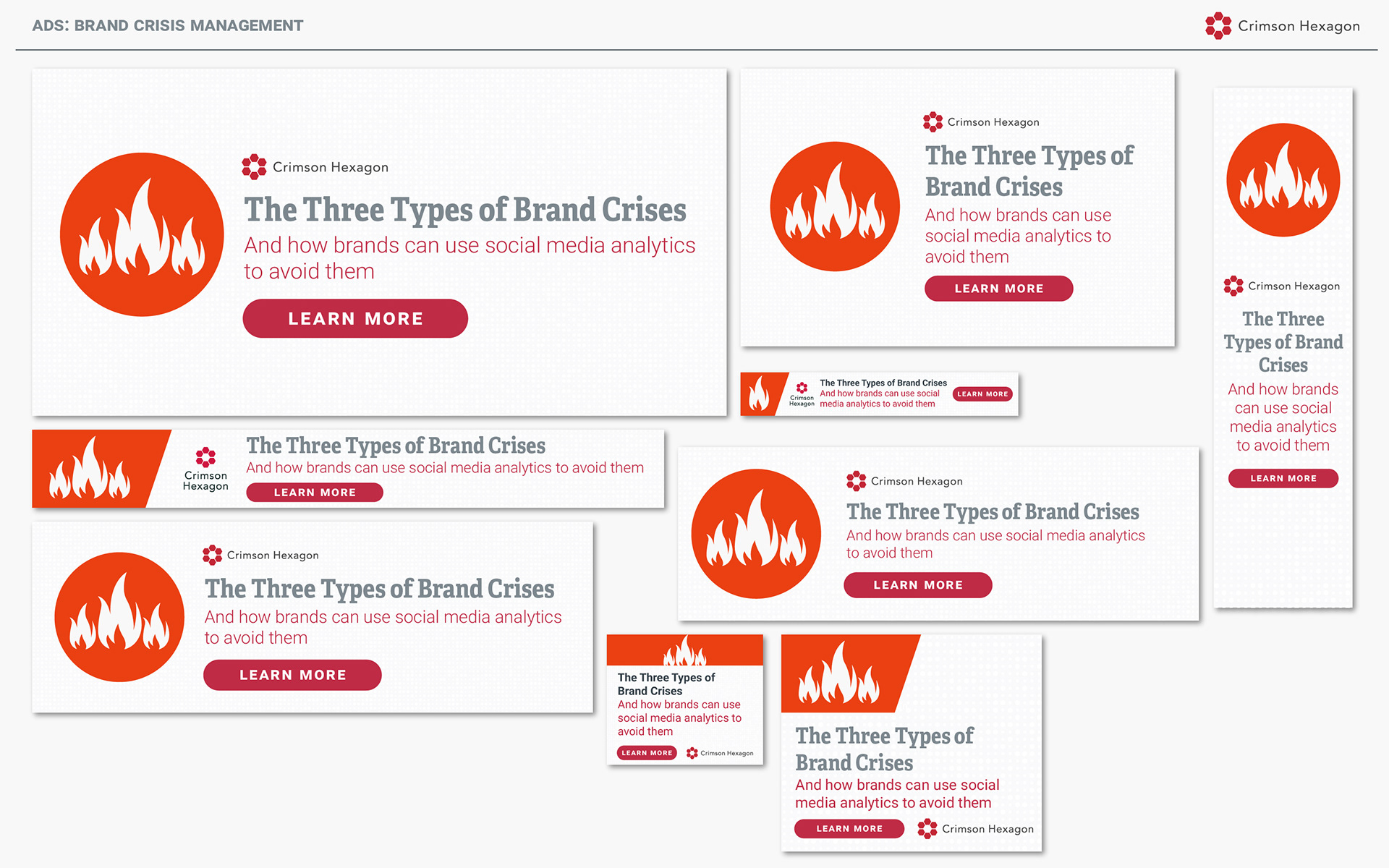
This summer, we happened to end up on the front page of the WSJ... for a not great reason. We hadn't done anything wrong, so once cleared we bounced back pretty quickly. We released a guide on three main types of crises that brands can face, and how to avoid them (or what to do if the damage is done). Initially I thought about using some terrifying imagery of smoldering ruins, but decided to move in a more minimalist, less alarmist direction.
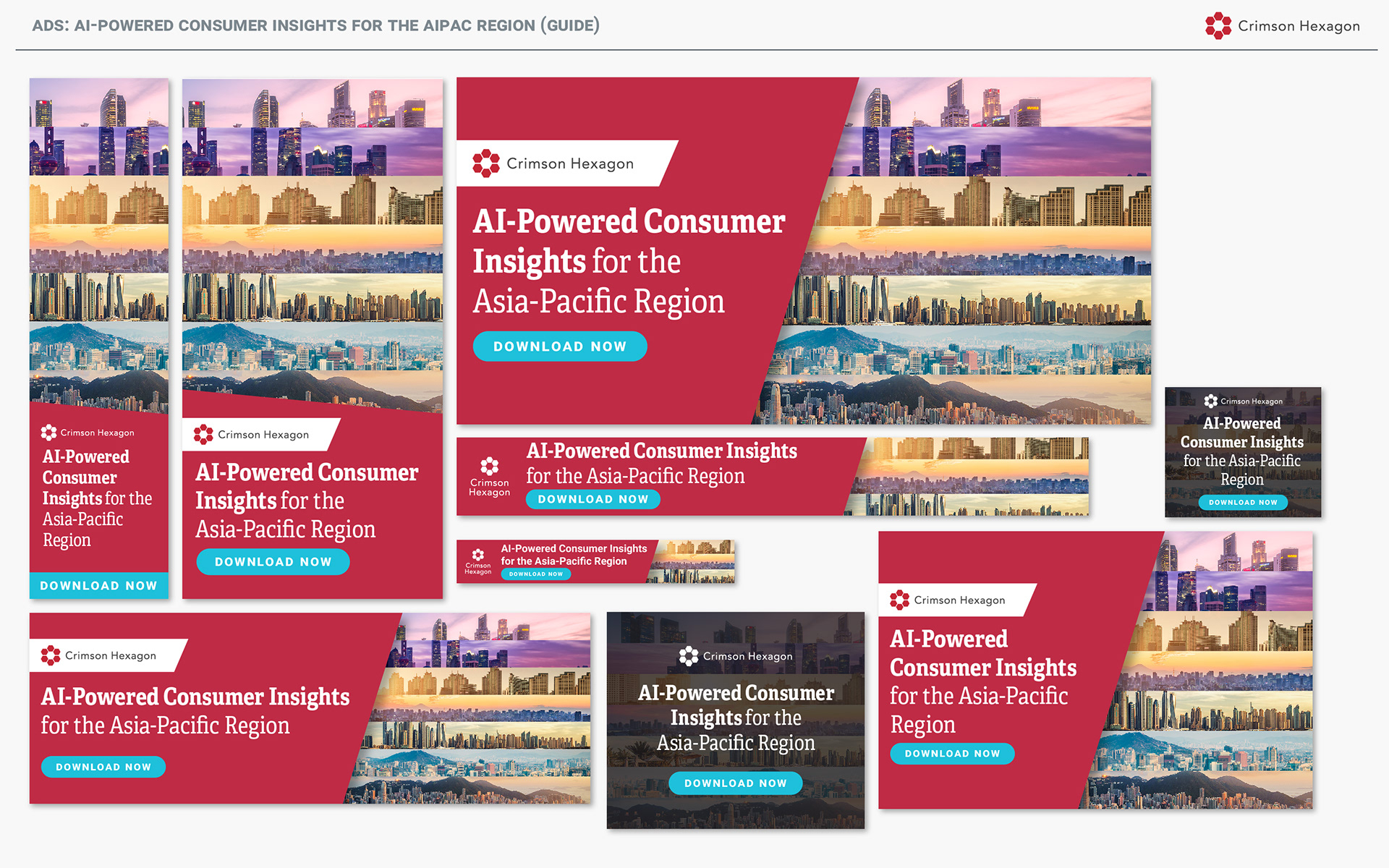
Designing ads for a single country in Asia could be tricky, since there's so many cities and regions within an individual country. Designing ads for the entire region seemed intimidating, until I realized that they all have really, really photogenic skylines.
One of the first series of ads we did under the new brand direction, I felt it important to go all-out with our crimson and new pattern.
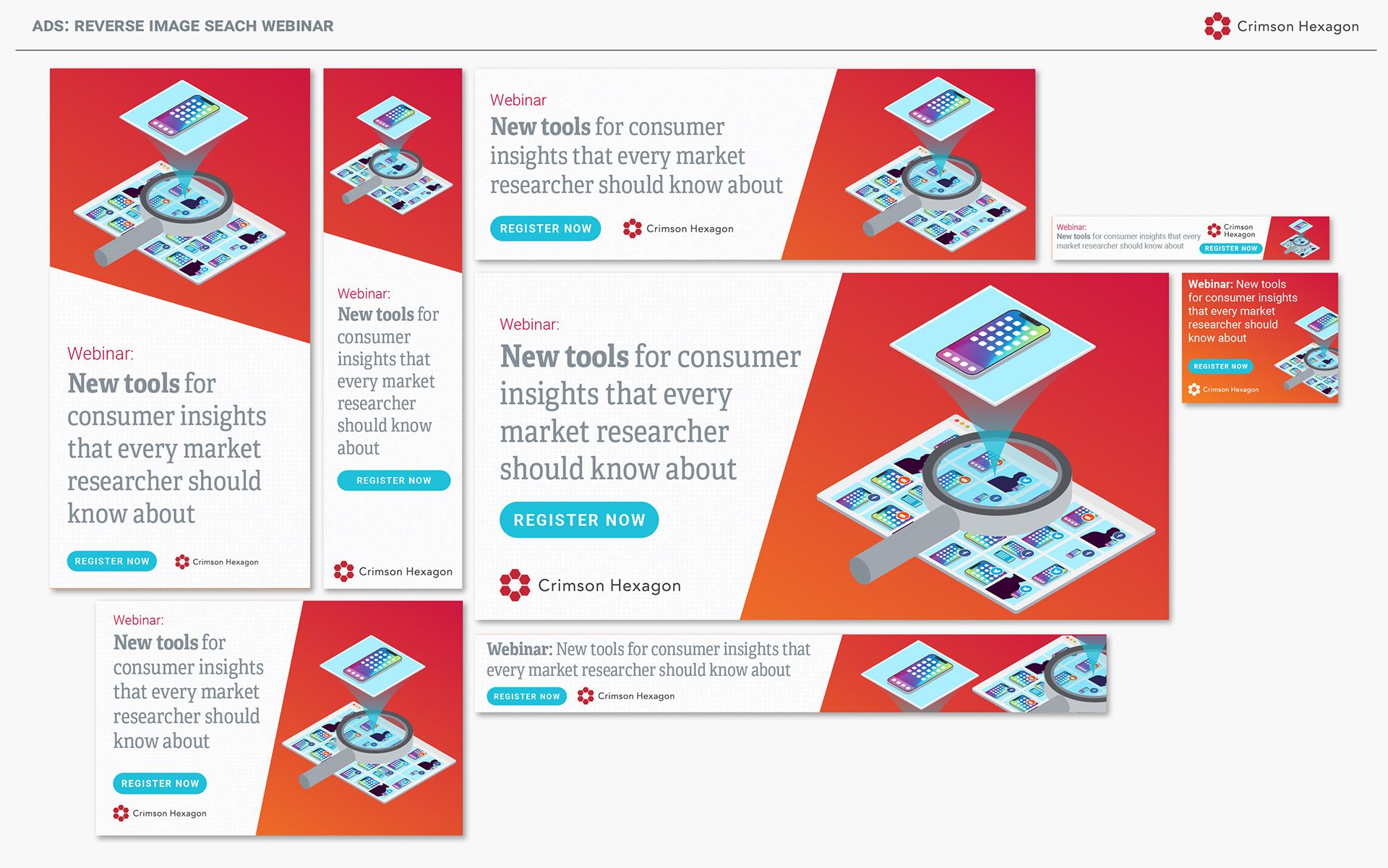
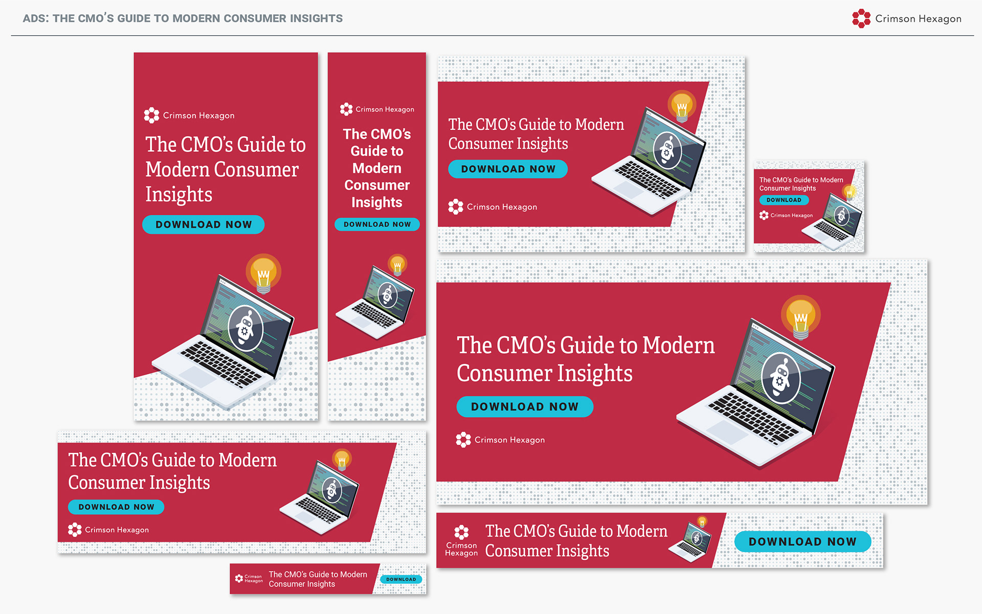
Our team does a number of webinars, so creating assets for a new feature on the platform was exciting. It was a challenge to come up with a single image that was representative of "customers can use the platform to input an image and search for results based upon the input image", but I think I got the gist of it down.
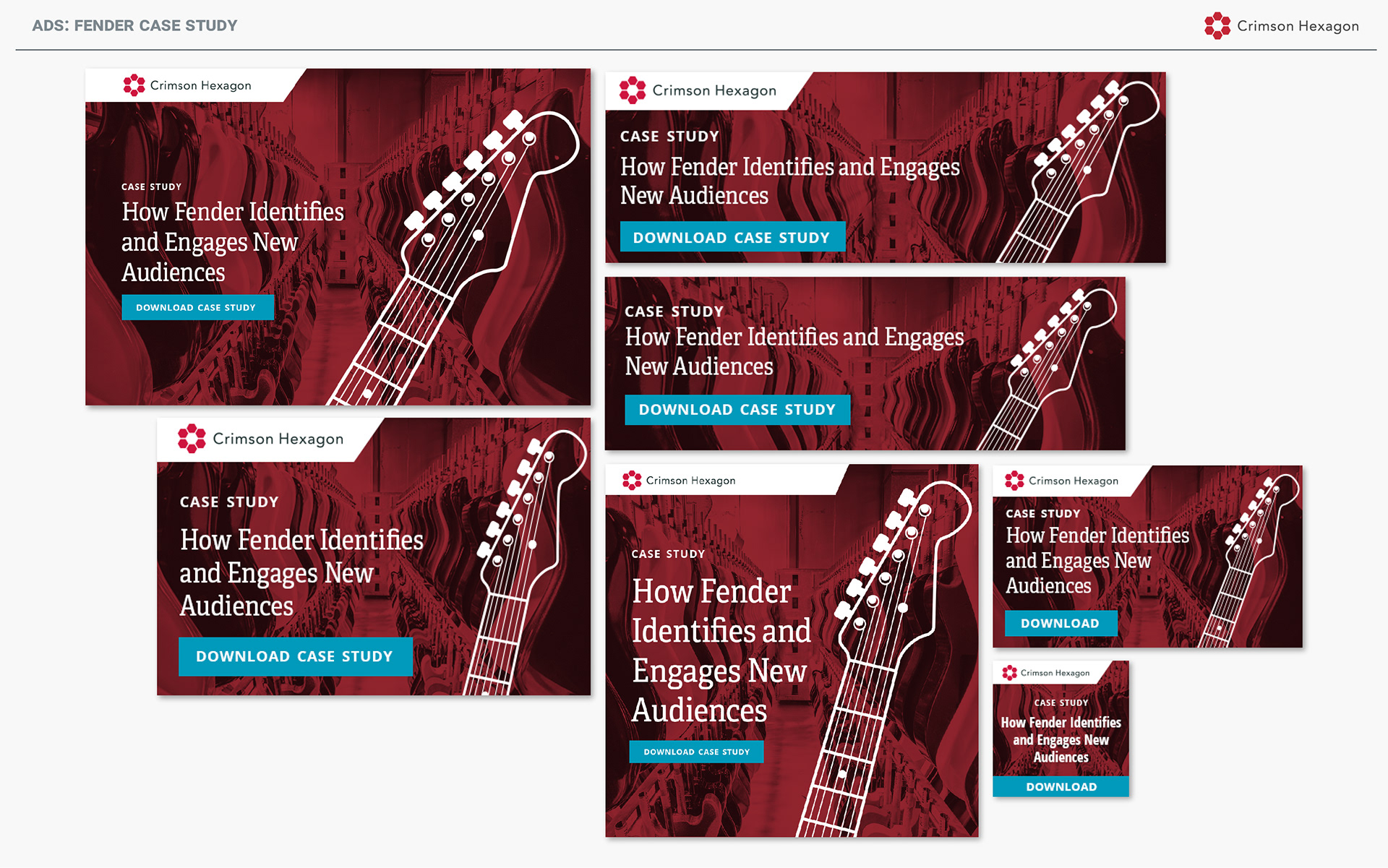
This was an older ad series, from 2017 (prior to the rebrand), but still an old favorite, since you can't go wrong with photos of guitars.