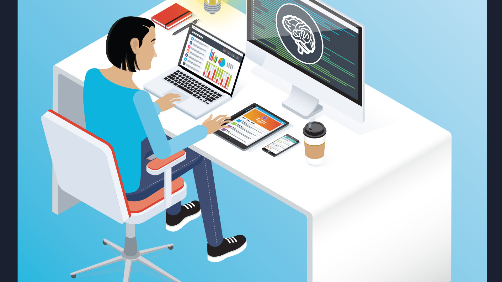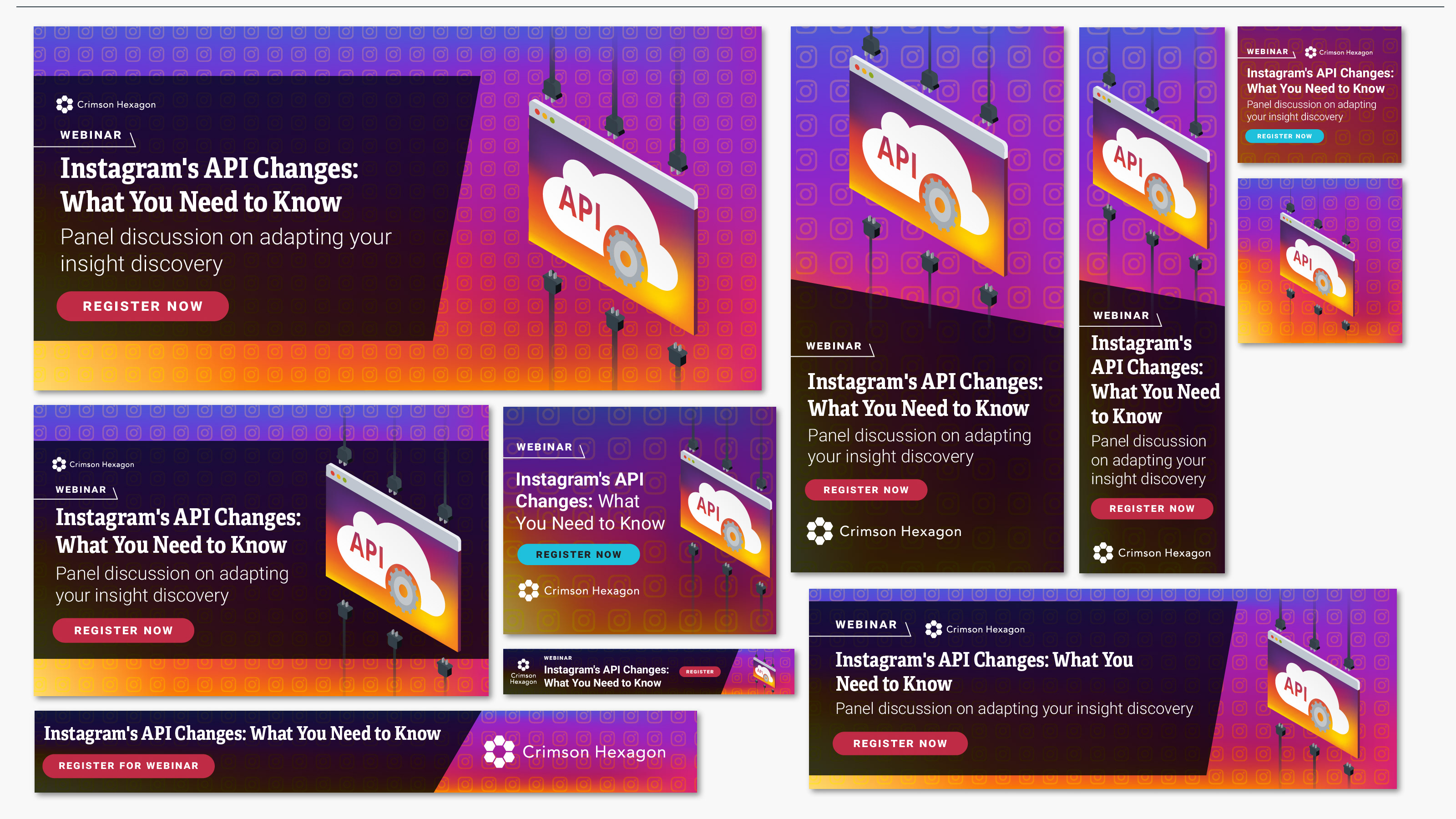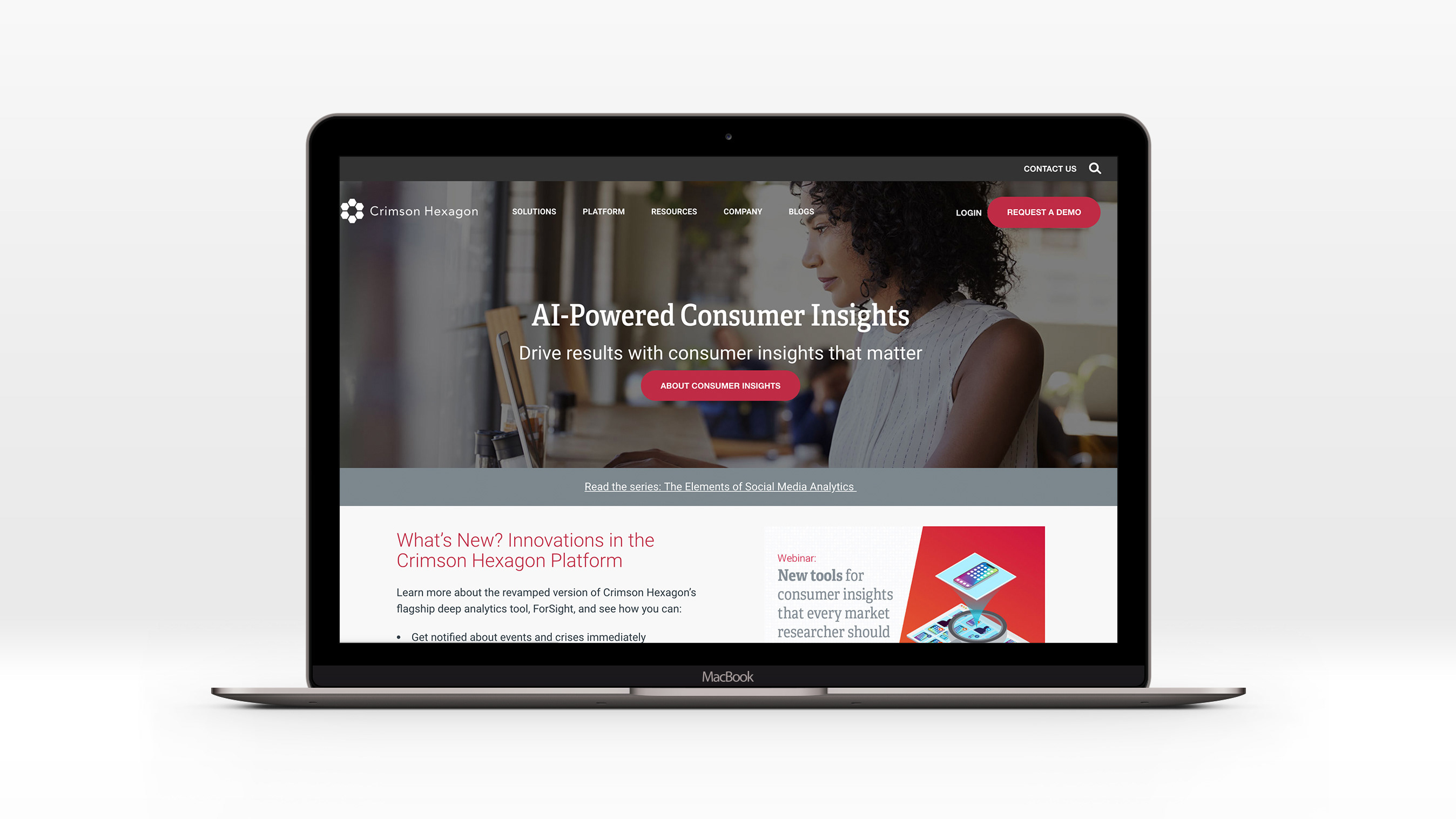
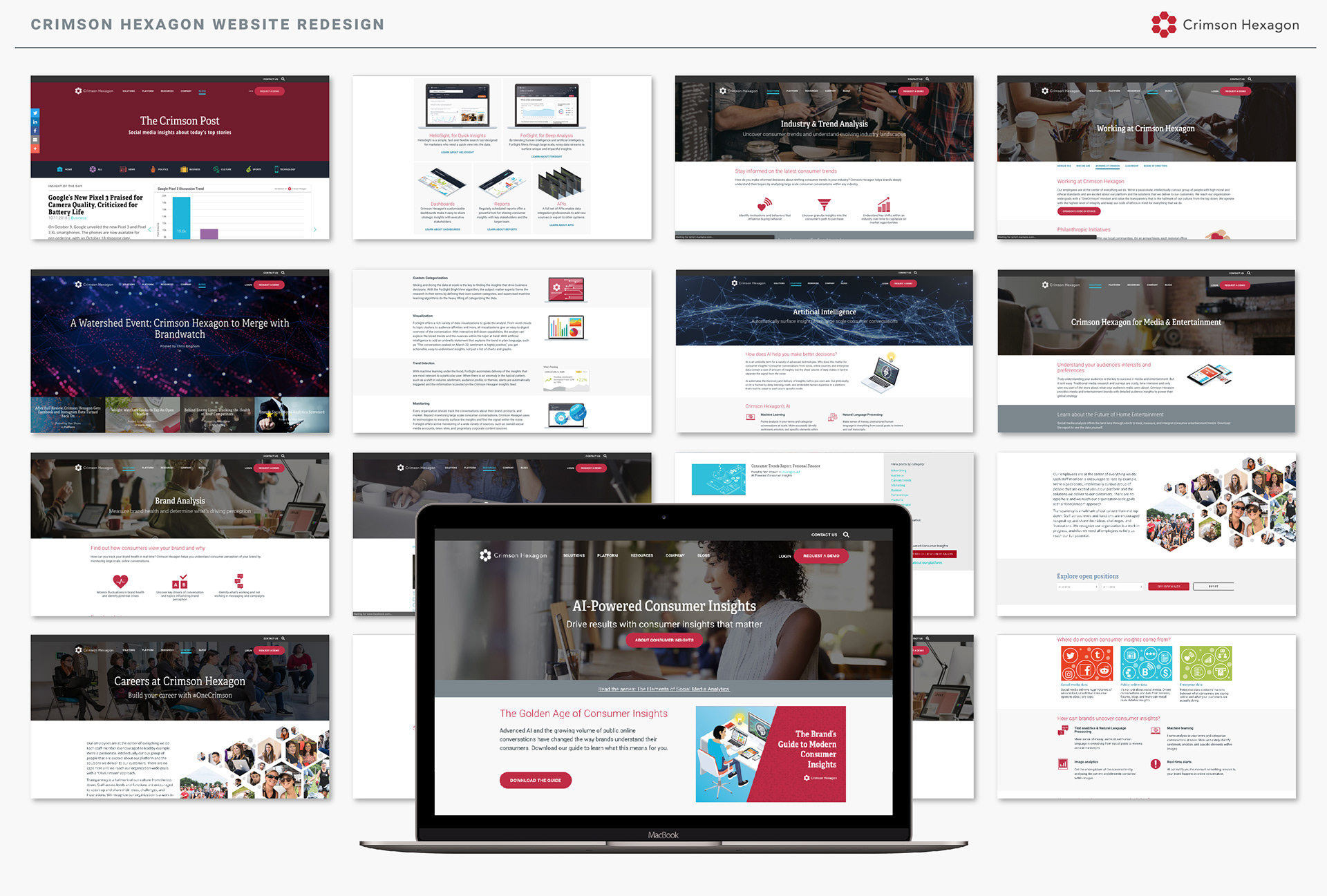
We began planning the website redesign in winter 2018, under direction of a new CMO and with a new message for the company based on delivering consumer insights powered by the products AI. Additionally, we were updating the branding at the same time, and applying these new brand elements and standards across the site: lighter, brighter, and airier than the previous iteration of the brand; no more turquoise; splashes of crimson with white and silver; and a new pattern that was visually denser but felt lighter.
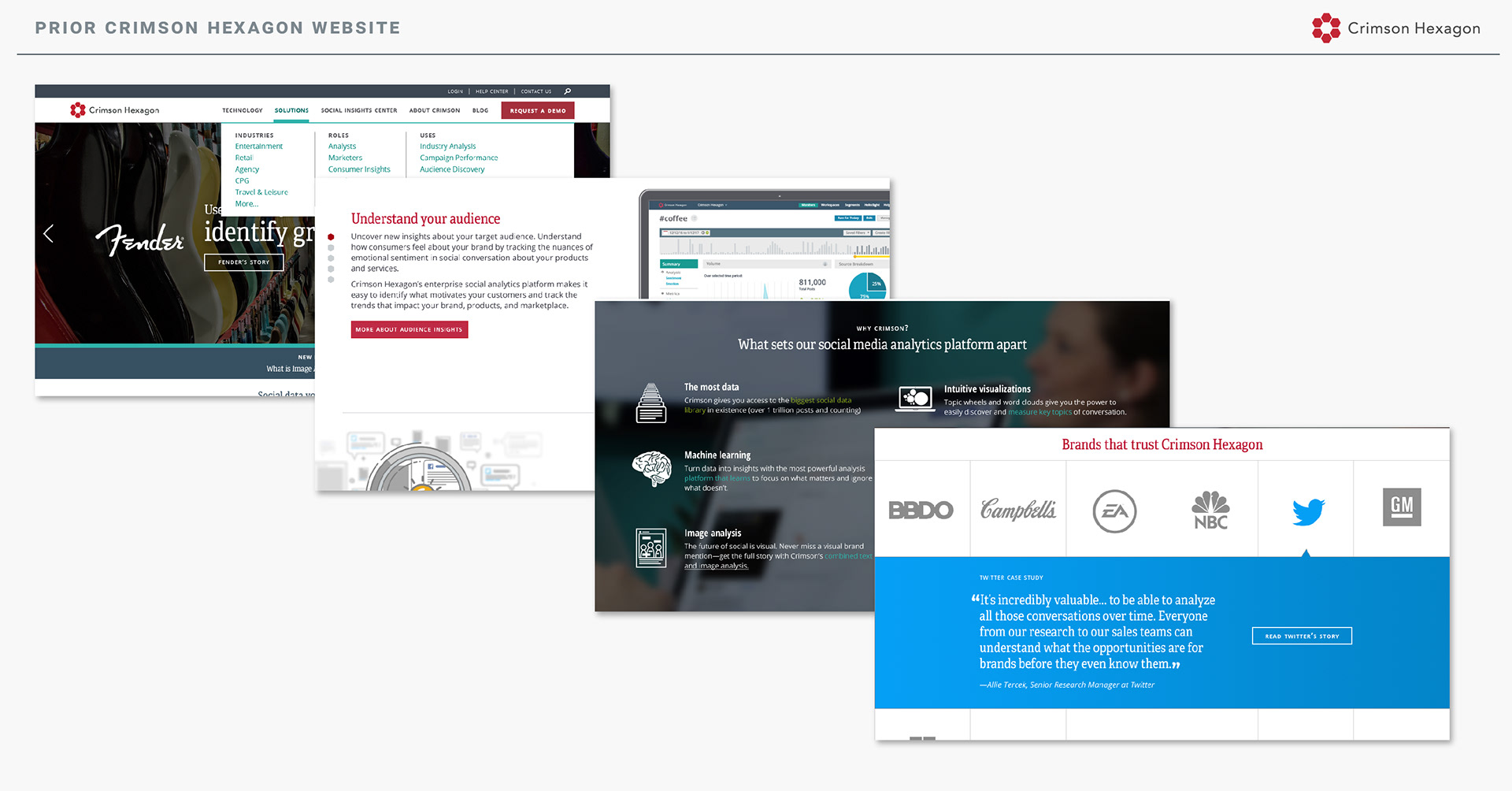
The initial site redesign (and brand refresh) was carried out in fall 2016. At the time, we needed to keep the original brand turquoise, so it was a design challenge to incorporate the fairly greenish turquoise with the red without it looking Christmas-y. We created a muted blue palette to work with both the red and the turquoise. The hexagon patterns were a new addition to the brand, which further differentiated our brand from competitors.

Frontify is an excellent resource for managing brand guidelines, allowing for collaboration and sharing. Having brand guidelines on Frontify allowed me to update the branding, assets, guidelines, and other elements quickly and efficiently, without having to update a PDF and send it around the company.
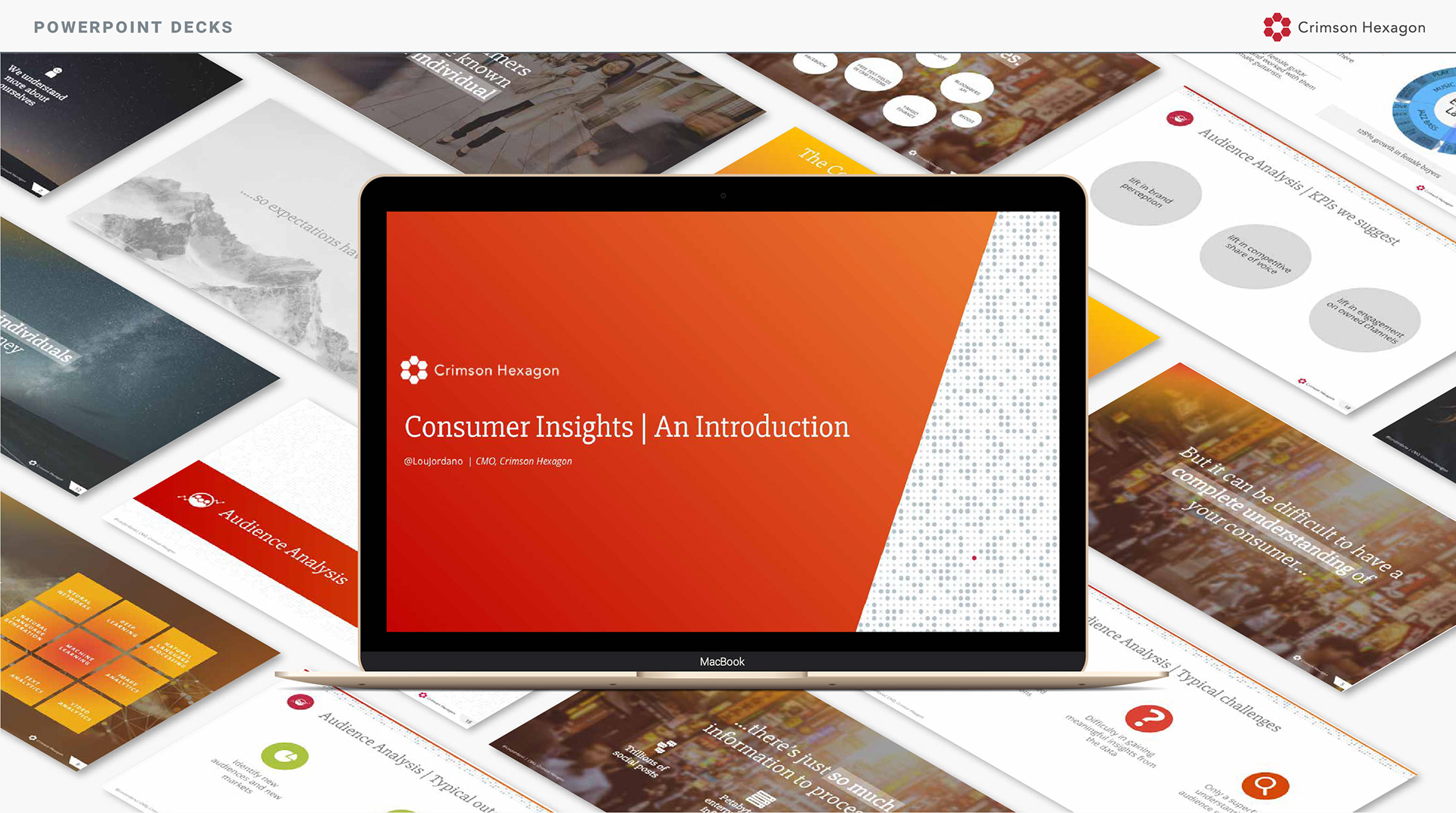
PowerPoint is generally a graphic designers worst nightmare. Compared to the Adobe Suite, it's clumsy tool. Over time I grew to enjoy the challenge of creating beautiful presentations in PowerPoint.
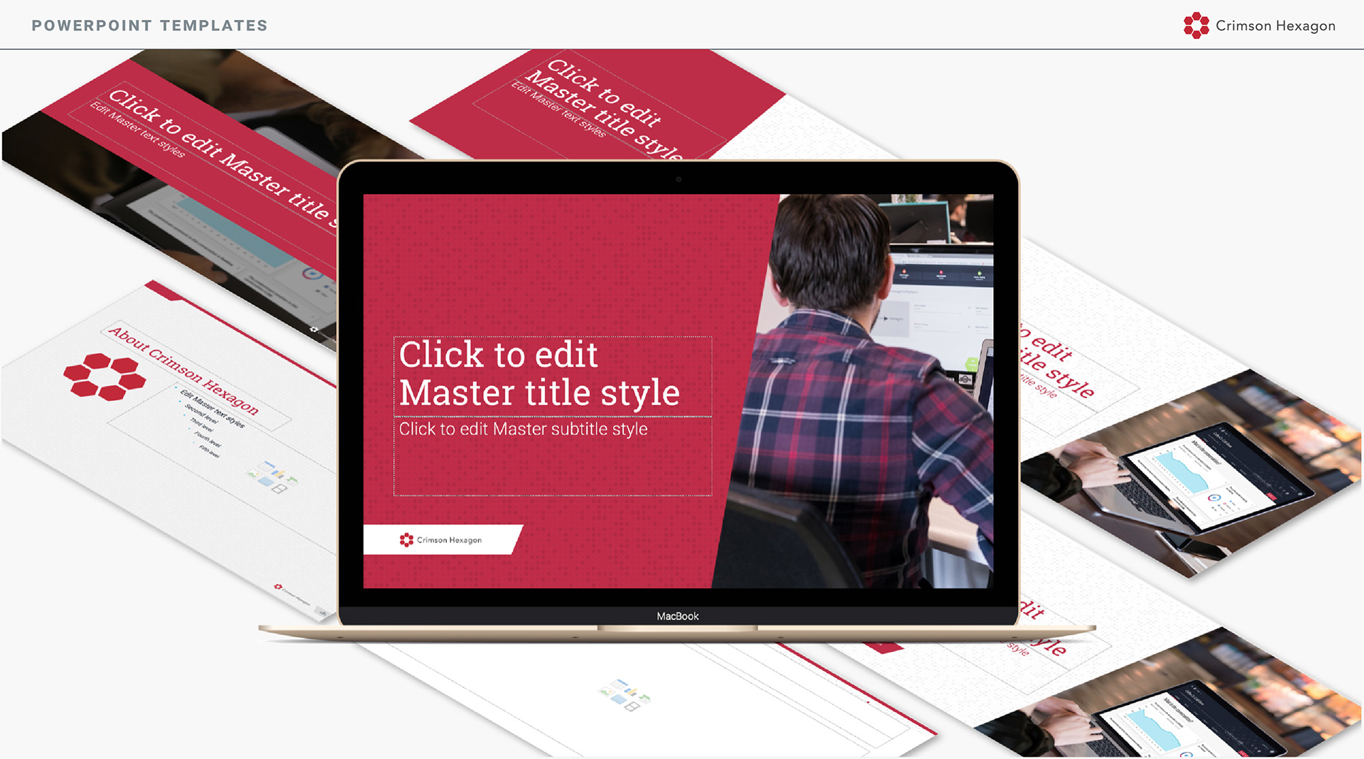
One of the most challenging aspects of working in PowerPoint was... learning how to use PowerPoint along the way. Thankfully I had very patient PowerPoint experts in other departments to consult with; we ended up with a few templates that were accessible to PowerPoint users of all levels.