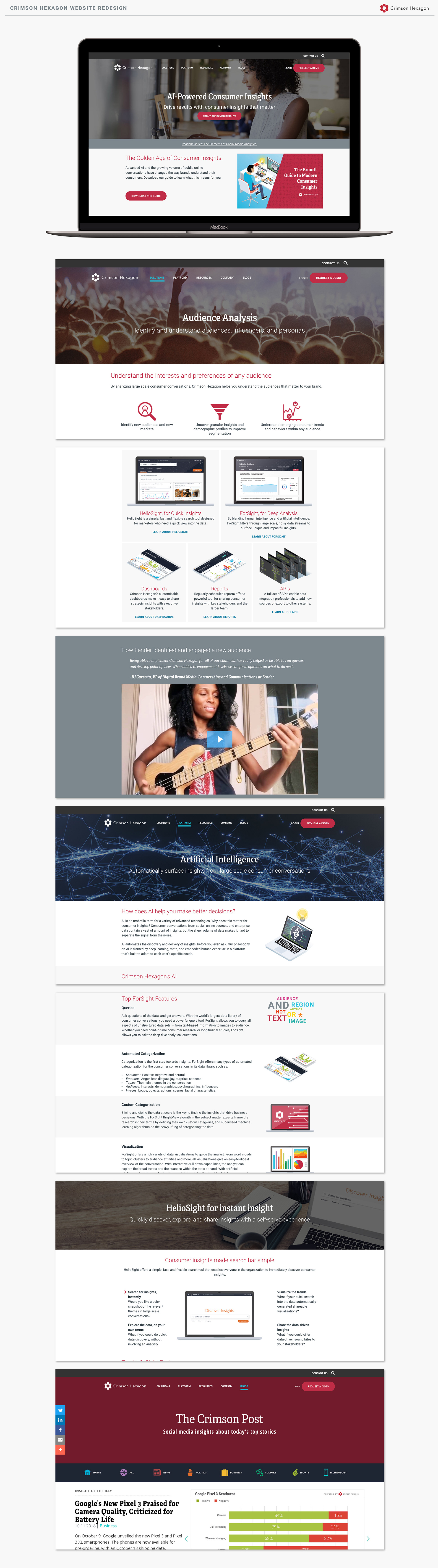
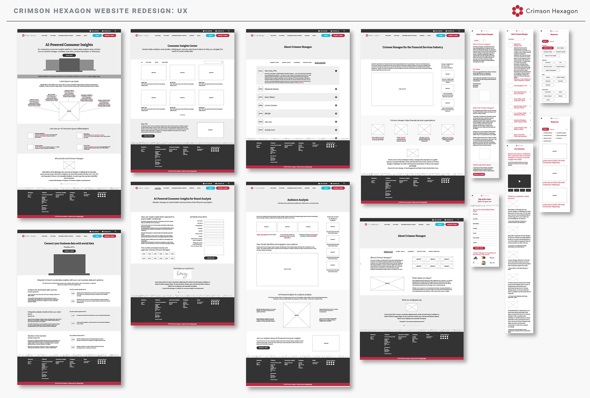
My wireframes were somewhere between lo-fi and hi-fi, in that some people we met with responded a bit better to more contrast (eg. the footer area) or an example image (eg. a laptop representing a platform rather than a placeholder box with "image" in the middle). These were built in Adobe XD.
There was more I had hoped to do from a UX and early stages standpoint. However, one's time is limited when you're the only designer in the company and are designing all the marketing materials in addition to the website! I created wireframes with feedback from the UX designers on the product team, pinging them whenever I had questions or concerns about usability.